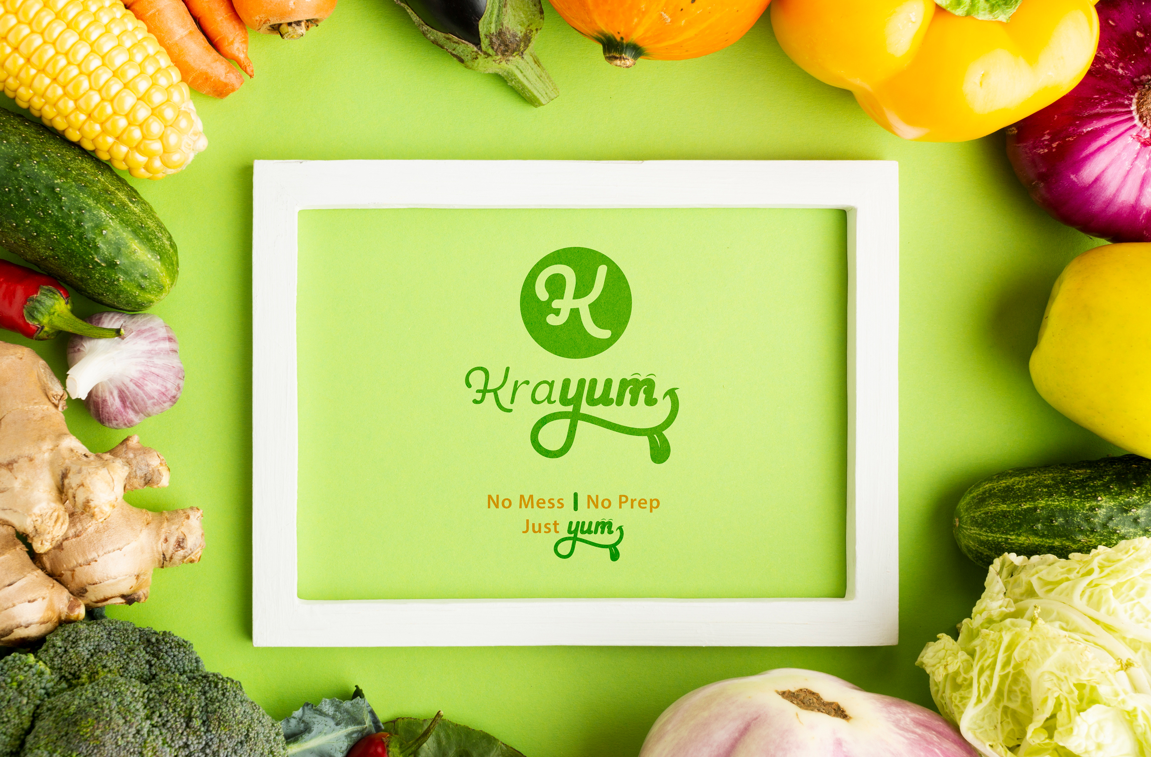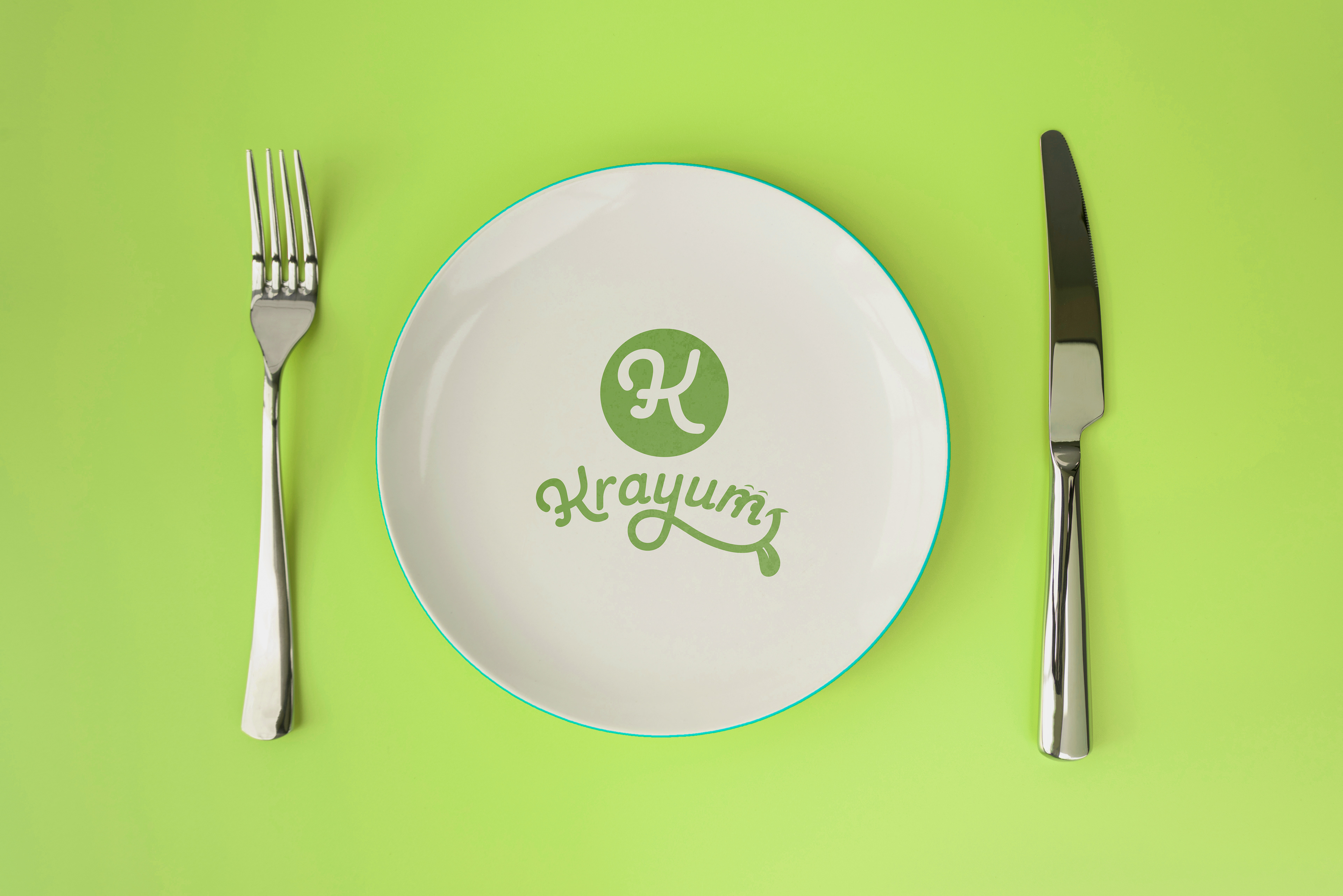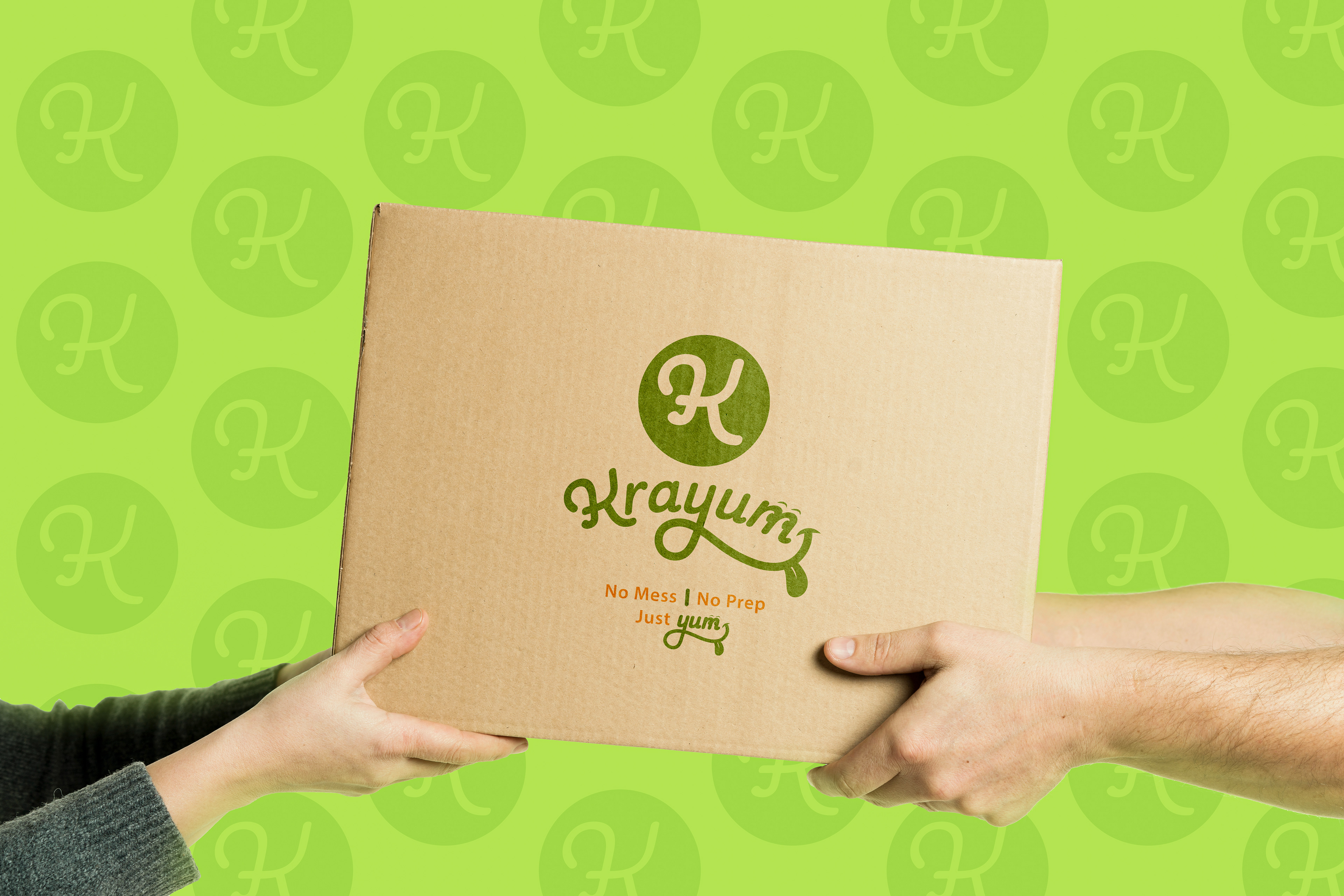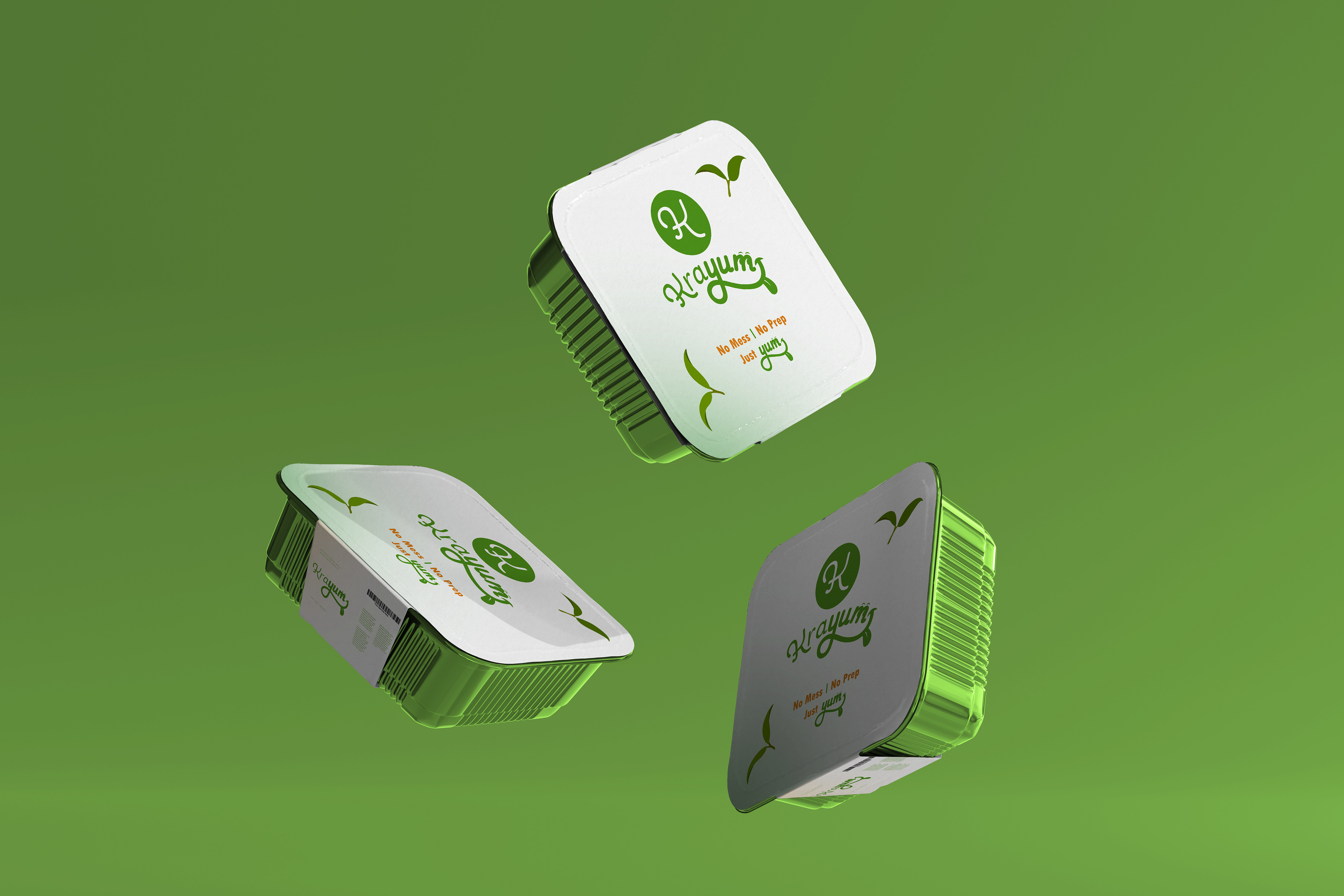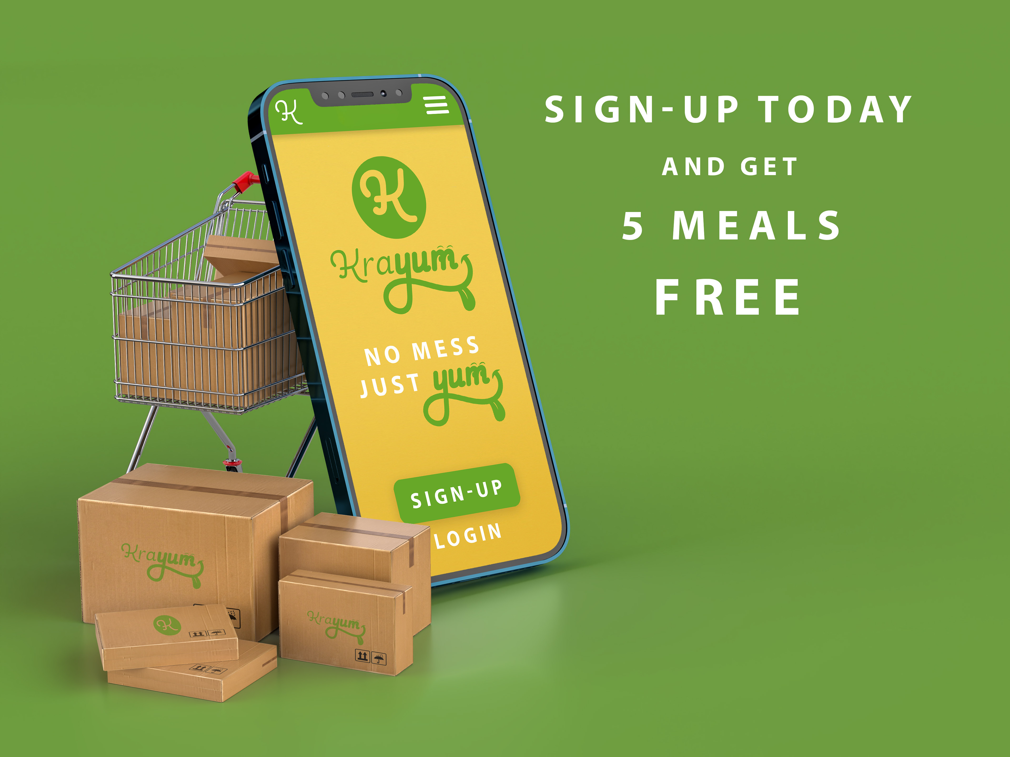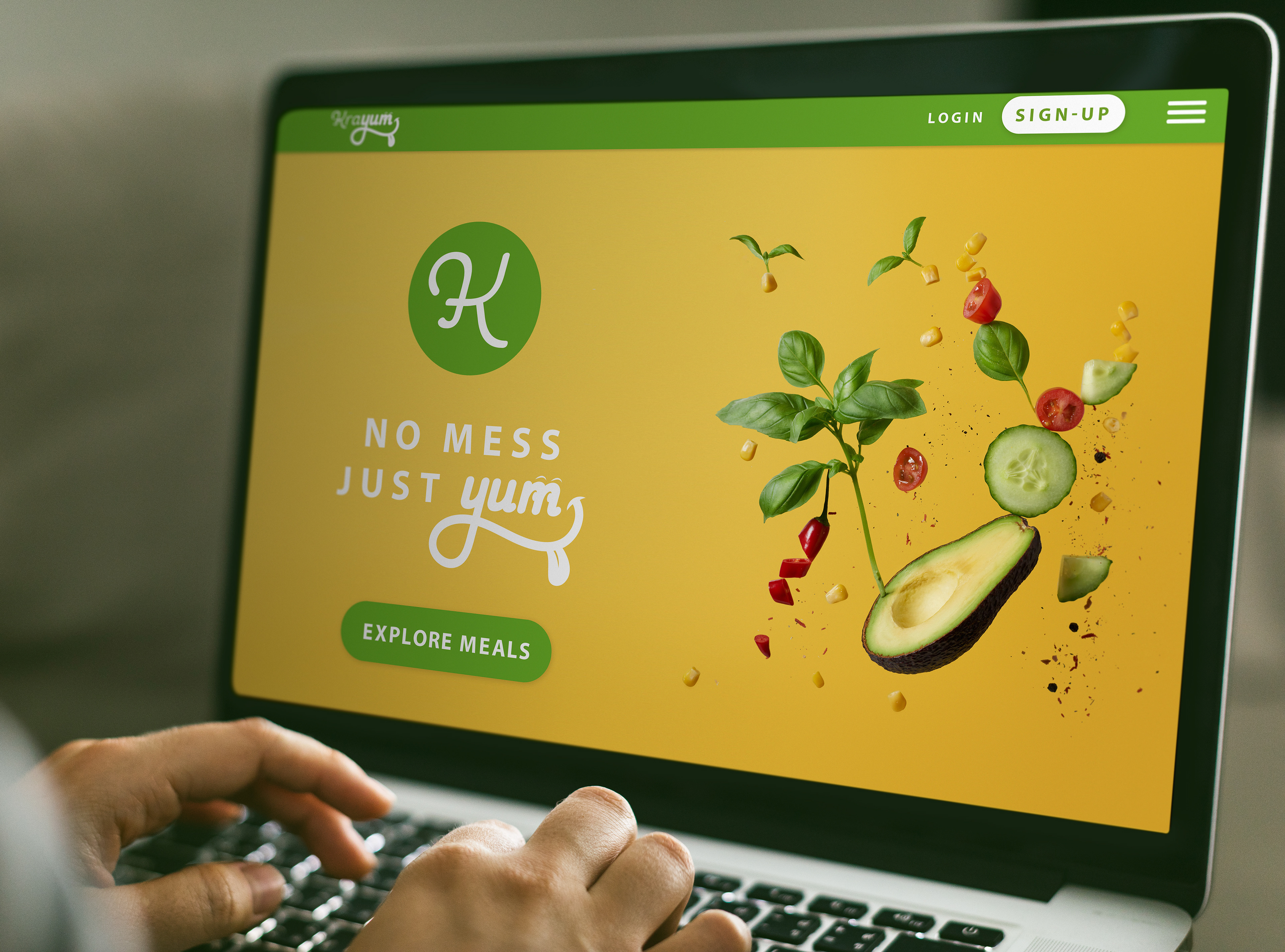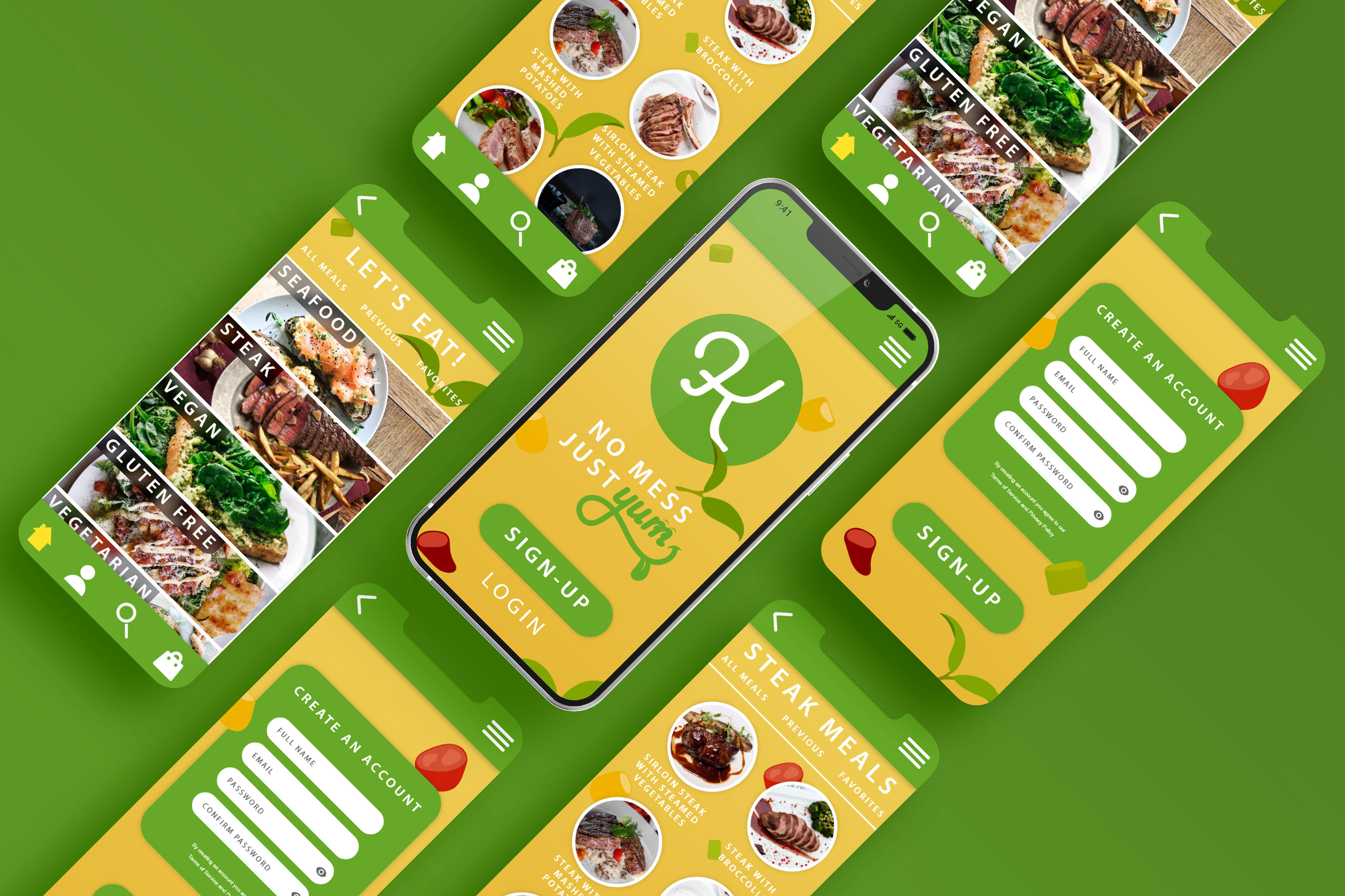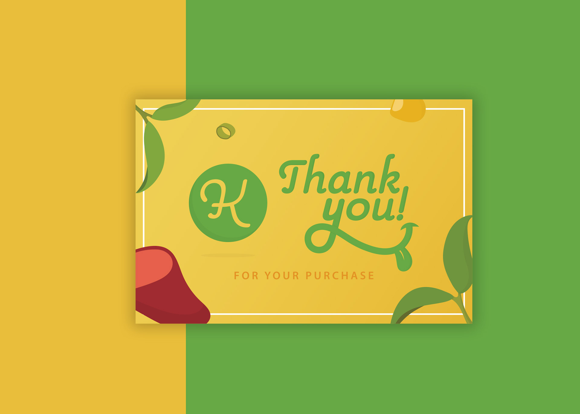
Krayum is a meal delivery service that offers a clean and healthy alternative to unhealthy habits. The client originally came to me with a couple of concepts for a logo that needed to be further explored and built upon. During the brief, the client described the brand as fun, inviting, and friendly. He also mentioned wanting an emphasis on the "yum." After doing research on similar brands and going through the mind-mapping phase, I began sketching concepts. My biggest issue quickly became creating a logo that felt fun and friendly, yet keeping it from feeling too childish. The typeface I went with is Pauline--it has edges with soft curves and rounded brush stroke ends making it feel very friendly. I then decreased the weight of "kra" and increased the weight of "yum" to add that emphasis. To further accentuate the "yum," I created a mouth out of the "y" that also acts as an underline. From there I added a tongue and noticed the "m" could hold a set of eyes. I was hesitant to add the eyes in the "m" as I feared it bordered the "too childish" territory--but ultimately, the client loved the design. For logo variations, I also created a minimal icon out of the "K" to be used for various branding aspects like social media, packaging, and patterns.